jun 2026
This is an original project I designed in order to show how I can document and present a design system. The name 'Pointer Aero' is a playful nod to the main method of interaction users perform to interact with web applications.
Gallery

This prototype is best viewed on a laptop or desktop computer.
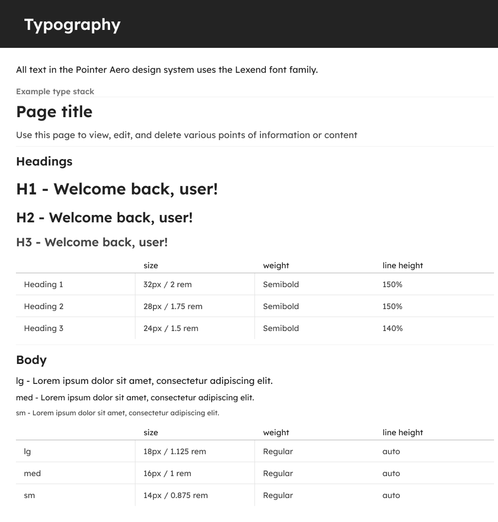
All text in the Pointer Aero design system uses the Lexend font family. This sans-serif font was chosen to convey a casual, easy to approach vibe for apps created within the system. This system was built with simplicity in mind, and as such there are only three headings and three styles for Body text.
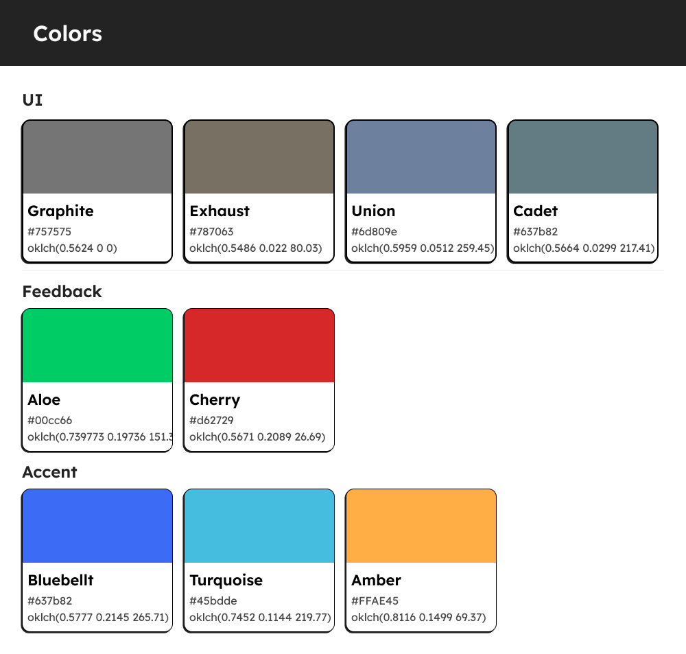
Pointer Aero utilizes 8 hues for its’ color palette.
UI colors are used for most surfaces and components, such as page backgrounds, the header and sidebars, and most action buttons. The Pointer Aero design system has multiple UI colors a designer can choose from as a way to customize the appearance of the app. To make sure these values do not compete with Feedback or Accent values, the only colors scoped for UI are a series of grays.
Feedback colors are colors with a semantic purpose. These colors communicate a type of action or activity to the user. Following common practices in web design, the green, Aloe, is used to convey succesful or confirmative actions, while the red, Cherry, is used to alert the user of danger, such as errors or warnings.
The design system has 3 accent colors a designer can use to add decorative elements, or to assign them a semantic purpose unique to their project’s purpose.
Every value used in the Bullet Journal design system is stored as a design token. Doing this allows Figma to act as a source of truth, as well as allowing an easier hand-off from designers to developers by consistently documenting the values used.
Each token falls into one of 4 categories:
- 1. Brand - These tokens are the foundation of the design system and the first step to establishing style. As their name implies, they are they full range of values allowed for use within the Bullet Journal “brand”. The simplest version of tokens are stored in this collection, and the rest all use Brand tokens as a source for their values.
- 2. Alias - Tokens at the alias level isolate which values should be used across different instances of a brand. These tokens allow designers to create unique appearances for separate application ecosystems, or themes within a single brand by assigning one token a value per theme.
The Bullet Journal design system’s alias tokens are used to let the user switch between a default theme and three alternative themes based on the activity feedback colors.
- 3. Mapped - Mapped tokens are the final level of assignment for color tokens. Each mapped token has a value for light and dark mode. At this level, tokens may also be assigned to specific components.
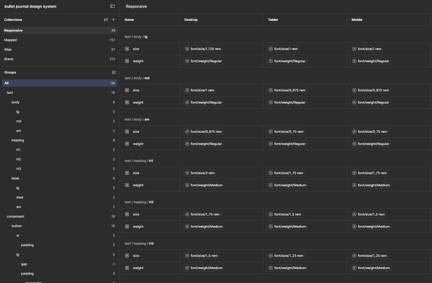
- 4. Responsive - These are the final assignment for numerical tokens and may also be assigned to specific components. These tokens have three values, one each for desktop, tablet, and mobile. Storing and using numerical values this way in Figma allows page and component designs to quickly swap between different device sizes without having to generate multiple versions of components. It also greatly reduces the memory usage in a Figma file.
This design system was used to create pages for another project in this portfolio, the Bullet Journal productivity tracker.